Constantia alternatives. Closest free font by our measurements: Bespoke Serif, score 85.
Bespoke Serif and Buenard tie at score 85 as the free fonts nearest Constantia, with Poly next at 84 of the 24 we measured.
5 / 5
Score 85 · closest by measurements
Bespoke Serif

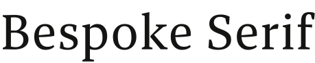

Fixed Bespoke Serif sample. Try your own words in the open alternatives.
Constantia

Against Constantia: x-height 12% taller, 11% wider, 7.1% lighter, and 14% less stroke contrast.
Letters that differ most from Constantia: Z, e, and 1.
Styles: 5 weights, with italics.
- ✓Logo
- ITF FFL 2.0
7 of the 24 reach 80 against Constantia.
Which Constantia alternative to pick
Choose Bespoke Serif for Constantia if you need 5 weights and italics: it shares the top score of 85, though it runs 11% wider. Buenard also scores 85 against Constantia and runs 4.8% narrower with ink 0.9% darker; for a darker heading, Castoro has ink 8.4% darker and 16% more stroke contrast. Buenard is the only one of the five without italics, and the only one the lab labels with an x-height shorter than Constantia’s. Poly and Castoro each bring a single weight with italics to Constantia work.
Where Bespoke Serif and Constantia differ
01 / Where the difference shows
Z, e, and 1: Bespoke Serif parts from Constantia most here
Bespoke Serif keeps Constantia’s weight within 7.1%; the widest gap is 14% less stroke contrast.
The lab labels Bespoke Serif against Constantia: x-height 12% taller, 11% wider, and 7% lighter.
- x-height+12%
- Width+11%
- Weight−7.1%
- Contrast−14%
Every free font measured against Constantia
| Free font | Score | x-height | Width | Weight | Contrast | Letters that differ |
|---|---|---|---|---|---|---|
| Bespoke Serif | 85 | +12% | +11% | −7.1% | −14% | Z e 1 |
| Buenard | 85 | −6.5% | −4.8% | +0.9% | −16% | e Q C |
| Poly | 84 | +4.5% | +3% | +4.7% | −29% | e C a |
| Castoro | 83 | +5.4% | +4.2% | +8.4% | +16% | y c t |
| Neco | 81 | +6.1% | +2.7% | −6.2% | −25% | J z j |
| Gambetta | 80 | −0.1% | +2.8% | −20% | −5.1% | 3 L 5 |
| Rowan | 80 | +8.5% | +5% | −8.1% | −31% | T 1 f |
| Vollkorn | 79 | +1.6% | +3.1% | +4.7% | −19% | t 0 3 |
| Alike | 78 | +12% | +5.3% | +3.7% | −3.1% | 3 5 2 |
| Vollkorn SC | 76 | +11% | +29% | −24% | −14% | 3 8 4 |
| Lusitana | 75 | −4.1% | −1.8% | +4% | −19% | O 9 C |
| Average | 75 | +0.8% | −3% | −2.8% | −32% | 4 e 9 |
| Gulzar | 75 | −2.8% | −2.9% | +7.2% | −3.5% | 1 t 3 |
| Ruwudu | 74 | −7.2% | −4.1% | +12% | −12% | p 3 e |
| Fenix | 74 | −0.6% | −4.6% | +1.6% | −49% | 1 3 Z |
| Radley | 73 | −3% | +1.5% | −1.1% | +5.6% | a t 8 |
| Manuale | 72 | +8.5% | +3.2% | −7% | −25% | 1 C 9 |
| Gelasio | 71 | +7.2% | +1.6% | +2.9% | −13% | J 4 j |
| Rufina | 71 | +7.8% | +8.1% | −6.4% | +72% | j p s |
| Playfair Display SC | 71 | +34% | +27% | −36% | +114% | C 1 L |
| Donegal One | 71 | +10% | +13% | +8.7% | −14% | O 2 1 |
| Gupter | 70 | −0.1% | −12% | −9% | −13% | 2 a 5 |
| Joan | 70 | +0.8% | −2.1% | −2.9% | −22% | O 0 e |
| Halant | 70 | +11% | −2.4% | −22% | −25% | L 1 7 |
Constantia or Sitka
Constantia is John Hudson’s serif of 2004 and Sitka is Matthew Carter’s; the lab measured 8 free fonts against both. Through them Constantia comes out 7.6% narrower than Sitka, with an x-height 5.4% shorter, 3.8% more ink and 29% more stroke contrast. Bespoke Serif and Buenard, tied at 85 for Constantia, score 77 and 72 against Sitka, and none of the five closest to Sitka is among the 24 free fonts measured against Constantia. Use this page when the text is set in Constantia.
Can I use these Constantia alternatives for…
| Free font | Web | App | Logo | Selling | Commercial | |
|---|---|---|---|---|---|---|
| Bespoke Serif | !* | !* | ✓ | ✓ | !* | ✓ |
| Buenard | ✓ | !* | ✓ | ✓ | ✓ | ✓ |
| Poly | ✓ | !* | ✓ | ✓ | ✓ | ✓ |
- * Bespoke Serif, Constantia alternatives on a website: your site’s text only; no visitor font selection or typing.
- * Bespoke Serif, Constantia alternatives inside an app: your app’s text only; never offered for user font selection or typing.
- * Bespoke Serif, Constantia alternatives on products you sell: your designs only; no customer text editor.
- * Buenard and Poly, Constantia alternatives inside an app: include the copyright notice and licence with the font files.
- ITF FFL 2.0 text
- OFL 1.1 text
- Full conditions for Constantia alternatives
Constantia alternatives: questions
What is the closest free alternative to Constantia?
Bespoke Serif scores 85 against Constantia, ahead of Buenard (85) and Poly (84) among 24 free fonts.
Which Constantia alternative is closest in size?
Neco matches Constantia’s width most closely (2.7% wider), and Poly its x-height (x-height 4.5% taller), of these 5.
How does Buenard differ from Constantia?
Buenard scores 85 against Constantia: x-height 6.5% shorter, 4.8% narrower, 0.9% heavier, and 16% less stroke contrast. Its e, Q, and C differ most from Constantia’s.
Which Constantia alternative has the most weights?
Bespoke Serif has the most of the Constantia picks here, 5 weights and italics; Neco has 4 weights, Buenard has 4 weights, and Poly has 1 weight.
Can I use the Constantia alternatives commercially?
Yes, all 5 free alternatives to Constantia here allow commercial work.
Is Constantia an open font?
No. Constantia ships with Windows 11 and Microsoft 365.
Paid fonts that share free alternatives with Constantia
- Palatino Linotype → Average8 free fonts measured against both, none among the closest to Constantia. Palatino Linotype against Constantia: x-height 3.3% taller, 4.3% wider, and 11% lighter.score 85
- Georgia → STIX Two Text6 free fonts measured against both, none among the closest to Constantia. Georgia against Constantia: x-height 6.4% taller, 1.6% wider, 1.2% heavier, and 5.1% more stroke contrast.score 87
About Constantia
John Hudson designed Constantia for Microsoft in 2004 as a transitional serif. Constantia ships with Windows 11 and Microsoft 365.
Besides Constantia, John Hudson designed Gabriola.
Constantia is a font by Microsoft; FontForThat is not affiliated with Microsoft; this is an independent comparison.