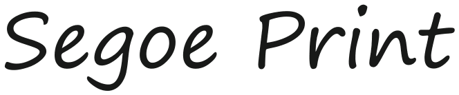
Segoe Print® alternatives. Closest free font by our measurements: Kalam, score 99.
Kalam leads with score 99 against Segoe Print, 12 points clear of Gveret Levin (87); Fuzzy Bubbles is third at 86 of the 24 free fonts we measured.
5 / 5
Score 99 · closest by measurements
Kalam
Sphinx of black quartz, judge my vow
Loading font…
Segoe Print

Against Segoe Print: x-height 6.5% shorter, 19% narrower, 14% heavier, and 22% more stroke contrast.
Letters that differ most from Segoe Print: 0, Q, and 1.
Styles: 3 weights, no italics.
- ✓Web
- ✓Logo
- ✓Selling
- OFL 1.1
5 of the 24 reach 80 against Segoe Print.
Which Segoe Print alternative to pick
Take Kalam for Segoe Print when score matters most: it scores 99 and offers 3 weights, though it runs 19% narrower and its ink is 14% darker. Fuzzy Bubbles is only 1.1% wider than Segoe Print and 13% lighter in ink; Monaspace Radon offers 7 weights and italics, the widest range among the Segoe Print picks. Four of the five carry a lab label for an x-height shorter than Segoe Print’s; Monaspace Radon, the exception, is labelled 11% wider than Segoe Print.
- Monaspace Radon differs from Segoe Print by just 0.2% in stroke contrast and 1.7% in lowercase height, but averages 11% wider. It offers the closest contrast of these Segoe Print picks rather than the closest overall score.
- Gveret Levin and Fuzzy Bubbles are one point apart against Segoe Print, 87 and 86, yet point in opposite weight directions: Gveret Levin carries 43% more ink, Fuzzy Bubbles 13% less. For Segoe Print lettering, compare their darkness before treating neighbouring scores as interchangeable choices.
Where Kalam and Segoe Print differ
01 / Where the difference shows
0, Q, and 1: Kalam parts from Segoe Print most here
Kalam keeps Segoe Print’s x-height within 6.5%; the widest gap is 22% more stroke contrast.
The lab labels Kalam against Segoe Print: 19% narrower, 14% heavier, and x-height 6% shorter.
- x-height−6.5%
- Width−19%
- Weight+14%
- Contrast+22%
Every free font measured against Segoe Print
| Free font | Score | x-height | Width | Weight | Contrast | Letters that differ |
|---|---|---|---|---|---|---|
| Kalam | 99 | −6.5% | −19% | +14% | +22% | 0 Q 1 |
| Gveret Levin | 87 | −3.8% | −3% | +43% | −20% | 9 S 2 |
| Fuzzy Bubbles | 86 | −3% | +1.1% | −13% | −7.8% | G o U |
| Mynerve | 81 | −17% | −15% | −6% | +6.1% | c p 9 |
| Monaspace Radon | 80 | −1.7% | +11% | +1.5% | +0.2% | 9 i I |
| Lumanosimo | 79 | +1.2% | +12% | −0.4% | +7.2% | U W I |
| Sedgwick Ave | 76 | +22% | −17% | +24% | +11% | Y W Q |
| Architects Daughter | 76 | −14% | −8.9% | −2.2% | −0.3% | 1 D y |
| Handlee | 74 | −9.8% | −22% | −7.9% | +56% | u O A |
| Mansalva | 74 | −30% | −14% | +39% | +75% | Q g o |
| Caveat | 72 | −35% | −35% | +10% | −3.6% | W U Q |
| Grape Nuts | 71 | −37% | −27% | −8.2% | none recorded | Y U W |
| Nothing You Could Do | 70 | −26% | −12% | −17% | −12% | U y i |
| Give You Glory | 69 | −0.3% | −17% | −27% | −26% | S U A |
| Gloria Hallelujah | 68 | −3.8% | −5.8% | +9.5% | −7.8% | u c I |
| Schoolbell | 67 | −14% | −22% | +15% | −7.3% | y d c |
| Playpen Sans | 67 | −0.1% | −4.1% | +11% | −3.6% | 9 G d |
| Delicious Handrawn | 67 | −21% | −34% | +50% | −16% | O c 1 |
| Sriracha | 66 | −10% | −11% | +45% | +33% | 9 6 8 |
| Shadows Into Light | 66 | +11% | −31% | −19% | −24% | 4 1 R |
| Covered By Your Grace | 66 | −11% | −32% | +26% | −20% | O U W |
| Short Stack | 65 | −0.7% | +13% | −5.3% | −3.7% | h y d |
| Bad Script | 64 | −5.7% | −31% | −11% | −4.8% | 6 S 5 |
| Sedgwick Ave Display | 64 | +16% | −20% | +40% | +59% | Y h r |
Segoe Print or Segoe Script
Measured against Segoe Script through 18 shared free fonts, Segoe Print comes out 8.5% narrower and 7.2% lighter, with an x-height 23% taller and 61% less stroke contrast. Kalam scores 99 for Segoe Print and 93 for Segoe Script; Fuzzy Bubbles keeps Segoe Print’s width within 1.1% while running 7.5% narrower than Segoe Script, and Gveret Levin scores 87 for Segoe Print against 78 for its sibling. For text in Segoe Print, this is the page to start from.
Can I use these Segoe Print alternatives for…
| Free font | Web | App | Logo | Selling | Commercial | |
|---|---|---|---|---|---|---|
| Kalam | ✓ | !* | ✓ | ✓ | ✓ | ✓ |
| Gveret Levin | ✓ | !* | ✓ | ✓ | ✓ | ✓ |
| Fuzzy Bubbles | ✓ | !* | ✓ | ✓ | ✓ | ✓ |
- * Kalam, Gveret Levin, and Fuzzy Bubbles, Segoe Print alternatives inside an app: include the copyright notice and licence with the font files.
- OFL 1.1 text
- Full conditions for Segoe Print alternatives
Segoe Print alternatives: questions
What is the closest free alternative to Segoe Print?
Kalam scores 99 against Segoe Print, ahead of Gveret Levin (87) and Fuzzy Bubbles (86) among 24 free fonts.
Which Segoe Print alternative is closest in size?
Fuzzy Bubbles matches Segoe Print’s width most closely (1.1% wider), and Monaspace Radon its x-height (x-height 1.7% shorter), of these 5.
How does Gveret Levin differ from Segoe Print?
Gveret Levin scores 87 against Segoe Print: x-height 3.8% shorter, 3% narrower, 43% heavier, and 20% less stroke contrast. Its 9, S, and 2 differ most from Segoe Print’s.
Which Segoe Print alternative has the most weights?
Monaspace Radon has the most of the Segoe Print picks here, 7 weights and italics; Kalam has 3 weights, Fuzzy Bubbles has 2 weights, and Gveret Levin has 1 weight.
Can I use the Segoe Print alternatives commercially?
Yes, all 5 free alternatives to Segoe Print here allow commercial work.
Is Segoe Print an open font?
No. Segoe Print ships with Windows 11 and Microsoft 365.
Paid fonts that share free alternatives with Segoe Print
- Comic Sans MS → Drama Sans10 free fonts measured against both, none among the closest to Segoe Print. Comic Sans MS against Segoe Print: x-height 1.2% shorter, 6.5% narrower, 14% heavier, and 14% less stroke contrast.score 100
- Ink Free → Give You Glory9 free fonts measured against both, none among the closest to Segoe Print. Ink Free against Segoe Print: x-height 3.6% shorter, 17% narrower, and 37% lighter.score 89
About Segoe Print
Segoe Print is a handwriting face that Carl Crossgrove, James Grieshaber and Karl Leuthold designed for Microsoft, with no year in our sources. Segoe Print comes with Windows 11 and Microsoft 365.
Segoe Print® is a trademark of Microsoft Corporation; FontForThat is not affiliated with Microsoft Corporation; this is an independent comparison.