Segoe UI® alternatives. Closest free font by our measurements: TASA Explorer, score 84.
TASA Explorer (84) edges out Sarabun (82) as the free font nearest Segoe UI; DejaVu Sans comes third at 79 of the 24 we measured.
5 / 5
Score 84 · closest by measurements
TASA Explorer
Sphinx of black quartz, judge my vow
Loading font…
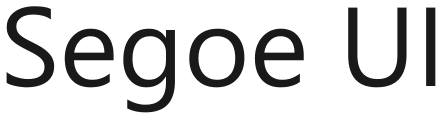
Segoe UI

Against Segoe UI: the same x-height, 6.7% wider, 1.7% heavier, and 5% more stroke contrast.
Letters that differ most from Segoe UI: 9, 4, and 7.
Styles: 5 weights, no italics.
- ✓Web
- ✓Logo
- ✓Selling
- OFL 1.1
2 of the 24 reach 80 against Segoe UI.
Which Segoe UI alternative to pick
Pick TASA Explorer for Segoe UI if score leads the choice: it scores 84 and offers 5 weights, with ink 1.7% darker. Sarabun scores 82 against Segoe UI and supplies 8 weights plus italics; for a markedly lighter page than Segoe UI, Tenor Sans has ink 10% lighter, although its stroke contrast is 95% higher.
Where TASA Explorer and Segoe UI differ
01 / Where the difference shows
9, 4, and 7: TASA Explorer parts from Segoe UI most here
TASA Explorer keeps Segoe UI’s x-height within 0.1%; the widest gap is 6.7% wider.
The lab labels TASA Explorer against Segoe UI: 7% wider.
- x-height0%
- Width+6.7%
- Weight+1.7%
- Contrast+5%
Every free font measured against Segoe UI
| Free font | Score | x-height | Width | Weight | Contrast | Letters that differ |
|---|---|---|---|---|---|---|
| TASA Explorer | 84 | 0% | +6.7% | +1.7% | +5% | 9 4 7 |
| Sarabun | 82 | 0% | −2.2% | +5.6% | +7.5% | l s c |
| DejaVu Sans | 79 | +9.4% | +14% | −1.3% | +2.5% | t j 7 |
| Amiko | 77 | +4.4% | +14% | −2.2% | +3.3% | p 1 o |
| Tenor Sans | 76 | 0% | +6.7% | −10% | +95% | 7 c N |
| Open Sans | 76 | +7% | +5.9% | −4.9% | +1.6% | g O c |
| Prompt | 76 | −4% | +12% | +16% | +5.7% | t J p |
| Albert Sans | 76 | 0% | +4.4% | −6.7% | −6.2% | s 9 J |
| M PLUS 1p | 76 | +4% | +10% | −15% | +2.7% | S j i |
| Figtree | 75 | 0% | +2.8% | +1.4% | −9.6% | 0 S J |
| TASA Orbiter | 75 | 0% | +5.9% | +5.7% | +3.9% | c Q j |
| Fixel | 75 | +4% | +5.1% | −5.6% | −13% | g S t |
| Moderustic | 75 | 0% | +9% | +4.5% | +5.7% | c a l |
| Funnel Sans | 74 | 0% | +2.5% | +8.5% | −9% | s 1 C |
| Carme | 74 | 0% | +6% | −0.7% | −12% | q s p |
| Overused Grotesk | 74 | 0% | −1% | +9.6% | −7.2% | S C Q |
| Excon | 74 | +3.6% | +10% | +5.2% | −14% | t 7 2 |
| Prodigy Sans | 73 | 0% | +3.8% | +1.4% | −2.4% | l s J |
| Mulish | 73 | +0.5% | +6.1% | −3.9% | +2.7% | a s 5 |
| Varela | 73 | +2% | +9.3% | +6% | −9.9% | 7 r p |
| Haskoy | 73 | 0% | −1% | −5.7% | −12% | 4 c J |
| Kantumruy Pro | 73 | 0% | +6.1% | −10% | −4.6% | J S l |
| Paysage | 73 | −8% | +0.1% | 0% | −6.9% | f g j |
| M PLUS 2 | 72 | +4% | +10% | −7.9% | −3% | t S M |
Can I use these Segoe UI alternatives for…
| Free font | Web | App | Logo | Selling | Commercial | |
|---|---|---|---|---|---|---|
| TASA Explorer | ✓ | !* | ✓ | ✓ | ✓ | ✓ |
| Sarabun | ✓ | !* | ✓ | ✓ | ✓ | ✓ |
| DejaVu Sans | !* | !* | ✓ | ✓ | ✓ | ✓ |
- * TASA Explorer and Sarabun, Segoe UI alternatives inside an app: include the copyright notice and licence with the font files.
- * DejaVu Sans, Segoe UI alternatives on a website or inside an app: include the copyright notice and licence with the font files.
- OFL 1.1 text
- DejaVu Fonts licence text
- Full conditions for Segoe UI alternatives
Segoe UI alternatives: questions
What is the closest free alternative to Segoe UI?
TASA Explorer scores 84 against Segoe UI, ahead of Sarabun (82) and DejaVu Sans (79) among 24 free fonts.
Which Segoe UI alternative is closest in size?
Sarabun matches Segoe UI’s width most closely (2.2% narrower), and TASA Explorer its x-height (no measurable gap), of these 5.
How does Sarabun differ from Segoe UI?
Sarabun scores 82 against Segoe UI: the same x-height, 2.2% narrower, 5.6% heavier, and 7.5% more stroke contrast. Its l, s, and c differ most from Segoe UI’s.
Which Segoe UI alternative has the most weights?
Sarabun has the most of the Segoe UI picks here, 8 weights and italics; TASA Explorer has 5 weights, Amiko has 3 weights, and DejaVu Sans has 2 weights.
Can I use the Segoe UI alternatives commercially?
Yes, all 5 free alternatives to Segoe UI here allow commercial work.
Is Segoe UI an open font?
No. Segoe UI ships with Windows 11 and Microsoft 365.
Paid fonts that share free alternatives with Segoe UI
- Verdana → DejaVu SansShares DejaVu Sans and Amiko with Segoe UI. Verdana against Segoe UI: x-height 9.1% taller, 14% wider, 0.8% heavier, and 1.5% less stroke contrast.score 92
- Lucida Sans Unicode → DejaVu SansShares DejaVu Sans and Amiko with Segoe UI. Lucida Sans Unicode against Segoe UI: x-height 6.1% taller, 11% wider, 2.9% heavier, and 16% more stroke contrast.score 89
- Tahoma → DejaVu SansShares DejaVu Sans and Amiko with Segoe UI. Tahoma against Segoe UI: x-height 9.1% taller, 0.9% narrower, 13% heavier, and 1.5% less stroke contrast.score 88